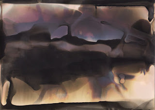
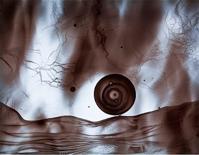
Quantcast
Channel: nonfigurativephoto
Viewing all 89 articles
Browse latest View live

Glassprints and chemigrams from the 2011 workshop

$
0
0
During the month of May, Manhattan Graphics is hosting an exhibit that celebrates student work from the most recent workshop in glassprints and chemigrams.  You should see it - much of it is very inspired, even unanticipated.  Each year the emphasis shifts a bit in the workshop, reflecting the makeup of the new student group as well as fresh approaches to the teaching of the material, including reworked views of

Kathleen Adams, chemigram


David Thomas, glassprint
 

what that material should be. This year saw, on the glassprint side, a loosening of old restrictions as to what a glassprint represents.  Gone are the fusty rules about carefully mimicking, in brushed ink or smudged marker, a genre scene on acetate.  No landscapes are found here, no vases of flowers on tables with hunting horns.  I used to think that was good strong medicine but it seems the patient is cured.  Instead, we found greater freedom than expected with gobos (Andrea Matura) and scrims (David Thomas), sandwich compositions (Thomas again) and paper negatives (Matura again).  In chemigrams we did some of the usual dip n' dunk, spritzing on the hydroxide and the solvent, but we also got serious about hard resists, and many students went into their toolbox for intricate iconography.  The results show.  Paul Kleinman's resist-filled composition is outstanding; Kathleen Adams' flirt with dichroic dangers is a lot of fun too.  Here's more pictures from the show.

Eva Nikolova, chemigram


Paul Kleinman, chemigram


Andrea Matura, glassprint


David Thomas, glassprint


Paul Kleinman, chemigram


David Thomas, glassprint


Andrea Matura, glassprint


Kathleen Adams, chemigram

Edward Mapplethorpe's Variations

$
0
0

Mapplethorpe, installation view


The Foley Gallery on West 28th Street has taken a big commitment to cameraless photography with their current, very elegant show of The Variations, a group of related chemigrams by Edward Mapplethorpe.

Mapplethorpe, Variation 10, 2011

Mapplethorpe, Variation 3, 2011

The colors dazzle from the moment you walk in - yellows, oranges, red-browns enmeshed in swirls of black and white structural elements - and you fall into a kind of trance until you leave.  These are large works too, up to 42 x 64", and tactile: each is unique, and traces of developer are visible on the paper surface.

They seem to be made using the freehand chemigramic method we've alluded to occasionally on this blog; most recently, for example, see the work of young Kathleen Adams.  This means you paint, daub, drip or smear on your fixer and developer as inspiration dictates, going this way and that, covering your surface, each layer modifying the previous somewhat, and then you proceed very quickly until a final fix and wash locks it up.  Chance clearly plays a role, and the artist in the end makes creative decisions as to what works and what doesn't.  Although Mapplethorpe wouldn't comment, it appears to my eye that he also used some hydroxide and thiocyanate to inflect the colors (Adams does too), available from Arista or Clayton.  For paper, it's my impression he's using the large rolls of warmtone from Ilford or Kentmere.

Mapplethorpe, Variation 7, 2011


Previously Mapplethorpe had been known for rather haunting portraits of one-year-old children, their eyes precociously heavy with wisdom, as well as for abstract experiments in various darkroom techniques which earned him a certain recognition - but none of it presaged his current work.  The good news is that the current work is quite accomplished, much of it beautiful.  For someone who traffics in gestural imagery, Mapplethorpe is able to convey the verve and thrill of the approach while maintaining focus and control, thanks to a fastidious skill in handling large paper sizes, large trays, and no doubt gallons of chemicals, not an easy thing - just ask Pollock.

opening reception, May 12


The show runs till June 18.  We think you should bookmark this artist.

Chemigrams in the IPCNY summer print show

$
0
0

There's something special, or especially elusive, about chemigrams that makes them one of the hardest of art objects to pin down, for those who like to classify things.  Are they paintings?  Mapplethorpe's new show suggests they are: in gesture, scale, ambition.  Or photographs?  Well, they're created on photographic paper by manipulating silver gelatin emulsion with fixer and developer, so they have the parentage.  Or are they prints, with affinities to lithographs and etchings?  The summer New Prints 2011 show at the International Print Center of New York, curated by Trenton Doyle Hancock and running from June 9 to July 29, 2011, proposes the latter.  Prints are about process, where the methods and restrictions in creating a plate often determine what the image pulled from it will look like.  The layers of work that go into it, the hours and days of drawing and scraping on a plate, are part of this process too, so when we consider a print we must think about time, a time of creation, very legible in the finished product in front of us.  In his remarkable curatorial essay, available on the IPCNY website, Hancock speaks not only of this time but also of timelessness, the infinite continuum in which the print resides: 'I am humbled by its disregard for the now,' he writes.  Where prints come from is a sacred place, and their very existence can lead us beyond our limiting temporality.


Collins, Things to come and the ways of coming, 2010

The chemigramist, of course, understands this intuitively. He has observed the mysterious kinetics of what happens in his trays, the physico-chemical reactions.  He watches shapes emerge, morph, and vanish, only to reappear elsewhere or in other guises.  His hand is respectful as he lifts off resist; as an artist he is a minor player.  He influences, but someone else is at his shoulder, some spirit.  He knows this.  So it was perhaps no surprise that two chemigrams by Douglas Collins were selected for this show, and yet these are the first chemigrams ever displayed at IPCNY, a capital in the world of printmaking.  The old order is giving way to the new.

Collins, Gentle bodies, 2010

A technical word: these pieces used Golden MSA varnish and were printed on Hahnemuehle German Etch paper with an Epson Stylus Pro 11880 printer.

Collins on left, Hancock on right at opening

The iterative art of Brittany Nelson

$
0
0
Nelson, Mordançage2, 72x72", C-print, 2011

She started dismantling photographs around 2006, as a student of Christina Z. Anderson at Montana State.  She had lots of acid and copper chloride and hydrogen peroxide laying around, and stacks of photo paper, and a secret drive to be a mad scientist.  She continued at Cranbrook outside Detroit, in the MFA program.  Hmm - what if we just remove the silver gelatin emulsion from the paper?  What happens then?  And maybe re-stick it over here, on another piece of paper?  And then expose it to UV light, in increments?  Or maybe quench it in different redevelopers, for different times, and take notes on everything?

Welcome to the art of Brittany Nelson, featuring mordançage, or gelatin relief as some prefer to call it.  One of the few alt-photographic methods to have developed in the last century (along with chemigrams) rather than the previous one, it was mentioned at least as early as 1927 in Louis-Philippe Clerc's La Technique Photographique, but didn't receive much attention among fine-art photographers until Jean-Pierre Sudre rediscovered it in the 1970s.  While most applications have been possibly a bit too mundanely representational for Brittany's taste, she was pulled in by the endless possibilities for permutation of the variables, and for the pure physicality of the process.  You have to get very close to the materials for this kind of thing to work, and the bad part is they are largely poisonous.

Nelson, Mordançage3, 72x72", C-print, 2011

As a refresher, let us recall the basics.  A silver gelatin print is placed in a bath of copper chloride, glacial acetic acid, and hydrogen peroxide, which does several things at once: the print is bleached, the emulsion (mainly in the black areas) is gently loosened, and everything becomes soft, mushy and mobile, depending on the length of the soak, the H2O2 concentration, and so forth - some of Brittany's variables.  The CuCl2 acts as an etch and mordant, which has a further consequence of promoting color shifts upon re-immersion in developer.  At this point the image can be reorganized, the bleached areas can be left white or not, the options are many.  For an excellent overview see Anderson's page on unblinking eye, extracted from her essential Experimental Photography Workbook.  Jalo Porkkala has an outstanding bleach-etch page too on his Vedos site, where he runs you through actual examples of the possibilities, but one has the feeling that even he leaves off early, refusing any deep confrontation with materials at the exact moment where Brittany's odyssey begins. 

Nelson, Mordançage4, 72x72", C-print, 2011

What can we say of the images she has given us thus far in her young career?  It's as if they were lab reports from another planet, the result of tweaks of a strange parameter: wisps and banners of emulsion streaming and foaming, pointing to processes beyond our knowledge.   She goes to lengths not to be gestural, but in vain.  She is curious and obsessed and it shows.  The payoff is beautiful.

For more on Brittany, visit her website.  Notice too that, like others who work in mordançage (it's a niche activity, definitely) she scans her fragile, diaphanous work, to create the relative permanency of a digital file from which she makes chromogenic prints, truly monster ones.  New York would be fortunate to see these some day, and richer for it.

A word about greenery...

$
0
0
While spending a couple of weeks this summer at the wonderful Zea Mays Printmaking in western Massachusetts investigating green (i.e. non-toxic) printmaking techniques, an opportunity came up to show and share the mysterious beauties of chemigrams, which in turn led to a query about the safety of chemigrams and photographic processes in general. In a world where most of us are exposed to any number of potentially harmful substances on any given day, this is no small matter. I had to admit to my fellow printmakers that as far as I know, there is no green way to produce a chemigram. Even apart from the toxicity of developers and fixers used in standard black and white processing, those of you who have experimented with hard resists (e.g. the various varnishes discussed in many of the posts on this blog) already know that the only ones that really work are those soluble in mineral spirits (Golden's MSA varnish and Liquitex's Soluvar, for example) and that these varnishes in turn need to be diluted with mineral spirits (full-strength, not odorless and not Turpenoid, neither of which work) in order for them to slowly lift during the chemigram development process. Some of you have probably had the pleasure of experiencing a mineral spirits-induced headache after a night in the darkroom or the printmaking studio. The only thing I can suggest to health-conscious chemigramists is to make sure you have adequate ventilation in your work area (darkroom ventilation is a given must-have, even if you are just doing basic black and white work) and wear disposable gloves at all times. Do not mistake your solvent jar or container for your coffee cup in the dim light of the darkroom.

I would certainly be interested in hearing from anyone who has suggestions to make chemigrams greener (cyanotype chemigrams? non-solvent based varnishes?)...but I suspect it may be one of those processes, like traditional lithography, that carries with it certain hazards no matter what. A safety-conscious chemigramist is of course a happy chemigramist...

The hand of Paul Bloomfield

$
0
0
Bloomfield, Dark Trees, 2008-10, drawing on photograph

Bloomfield, Heaven and Earth, 2011, oil on gelatin silver photogram

One of my more serendipitous encounters this summer was meeting artist/photographer and teacher Paul Bloomfield at a monotype workshop at Zea Mays Printmaking in western Massachusetts. I talked to Paul about chemigram techniques and in the course of a discussion about the overwhelming presence of digital photography in contemporary life, he revealed that he has long been making what we might call manipulated or enhanced photograms in the darkroom as a way of counteracting the ubiquity of the straight photographic image. Paul's methods are quite diverse: he sometimes "paints" with developer in the darkroom on unexposed photo paper, guided by the intuitive gestural motion of his hand since he can barely see the mark of the clear developer in the dim safelight aura. Sometimes he draws on an exposed and processed photographic image with oil pigments or markers. Sometimes he is content with a straightforward but still inherently mysterious photogram, which most readers of this blog will know is an image generated by placing objects or filters/screens/whatever on photographic paper and allowing light from the enlarger to pass through or not depending on the object's transparency or opacity.


Bloomfield, Mayan Visions II, 2010, photogram

Paul's work incorporates pattern and elements of seriality or repetition as well as marks/forms derived from nature, which he claims in the modest artist's statement on his website allow him to meditate on systems, manifestations and impermanence. Some of Paul's work appears painterly and photographic simultaneously, which of course is the point: by reworking the lines and forms of a conventional photographic image through applied pigments or markers, for example, Paul reclaims the space and "trajectories" in the image from the otherwise inherent flattening quality of a photograph. (This is indeed the case in "Dark Trees," seen above.) The resulting work is a hybrid form that while not necessarily new (photographers have drawn on their prints before) suggests above all a reimposition of the hand in the photograph...which I've suggested in an earlier post is one of the strategies we might use to survive photographically in an overwhelmingly digital world.


Lightfastness of chemigram colors

$
0
0
Collins, Study #14, 2011
We continue to think and wonder about the colors created in chemigrams, where silver halide complexes, embedded in black and white photo paper, can be induced to yield a gamut of colors from the subtlest pinks and yellows to the richest indigos and violets.  Of the many questions evoked by the chemigram procedure - and there are many - one is paramount not just to artists, the chemigramists themselves, but to collectors, dealers and museums, indeed to the whole enterprise, and that is this: how permanent are these colors?  Do they degrade over time?  Which colors change in hue and which do not?  Over what timescales do changes, if any, occur?

First, a practitioner's observation.  Chemigram colors do in fact evolve and mutate throughout the entire creation pathway, as waves of fixer, developer and byproducts besiege the emulsion.  This continues, muted, into the final wash and even to the drying.  We know it because we see it.  It seems to persist for certain tones right into the early days of the post-dry period, though we're not sure where that ends, so lowkey do the changes eventually become.  It could be related to how much silver halide still clings to the paper, or how complete the wash was.  But even discounting that, such changes are real.  That's why some chemigramists prefer to scan their work as soon as it dries, to ensure the vibrancy of the original colors is preserved.  Nothing worse than having your work disappear on you.

a QUV weathering unit
What about the longer term - years, decades - what happens then?  To help find an answer our colleagues in the laboratory at Golden Paints in New Berlin NY conducted lightfastness tests on chemigram samples we provided, using their state-of-the-art QUV apparatus.  This device exposes samples to UV radiation simulating indoor, gallery-lit conditions, but vastly compresses the timeframes: 400 hours of constant exposure in this box is the equivalent of 33 years in the real world (technical details are found on the Q-lab website).  We went for a century - a nice unit! - in three 400-hour segments, at the end of each of which the samples were withdrawn and compared to the original.  These comparisons could have been rigorously quantified in Cielab colorspace, the delta-E or amount of change could have been calculated, etc, but all we wanted was a first-look kind of result.  Here is some of what we found.


fig. 1

In figure 1 the upper right corner piece is the original; the three slices descending toward the left lower corner are pieces that received 400, 800, and 1200 hours of exposure respectively.  While difficult to see at the scale of this post, there is a slight loss of warmer reddish tones by 400 hours.  At 1200 hours there is an overall darkening, or perhaps dulling is a more accurate description, a vague muddiness.

fig. 2
In figure 2 the original is on the right, with progressive exposures increasing toward the left according to the technician's notes on the scan.  Of the many samples documented this showed by far the most dramatic changes, with the warm tones dropping out completely even at 400 hours.  The subsequent gray tone maintains its value, but darkens somewhat by 1200 hours.

It is true that the snippets sampled were not uniform or even systematic: chemigram tray time, paper type, wash time, idiosyncracies of the artists (several supplied samples) all varied considerably.  In addition, the UV spectrum used in the exposures may not be predictive of actual conditions in a gallery, where lighting can vary from fluorescent of various types to daylight.  And yet from this we feel entitled to form certain impressions - a sense of the slow degradation of the colors, some perhaps more than others, against a background of an inevitable increase in entropy.  Left unspoken is the mechanism for these changes, since chemigram colors owe nothing to either dyes or pigments but instead to the size of certain objects - polymorphic clumps of silver bromide or chloride - and the wavelengths of light reflected from them.  The Mie effect was mentioned in an earlier post, and will be revisited in the future.  Still, for now we can be cautiously optimistic in the belief that, if our chemigrams have not altogether gone bad in our trays before we hang them out to dry, they will be around in some form for quite a while, maybe a century.


Chemigram shows for rest of the year, including some you'll have to travel to

$
0
0
Man-Kit Lam, 2005

For those with a yen for travel, we've gathered a few shows you may want to catch before the year is out.  All include chemigrams either solely or in part or, in Ms Rossiter's case, include what might be called a chemigramic inflection - and for that reason alone they're all worth seeing, besides the utter beauty and mystery of them.  If we've missed your show, please post a comment and we'll fix it.

Pierre Cordier 
Paris Photo, HackelBury Gallery, November 10-13, 2011, Grand Palais, Paris, France

Dominic Man-Kit Lam
Ink Art: a world without rules, September 2011 & February 2012, Novel Plaza, 128 West Nanjing Road, Shanghai, China

Alison Rossiter
Art Platform LA, Yossi Milo Gallery, October 1-3, 2011, LA Mart, Los Angeles, California, USA

Alison Rossiter
Paris Photo, Stephen Bulger Gallery, November 10-13, 2011, Grand Palais, Paris, France

Edward Mapplethorpe
The Variations, October 5 - November 12, 2011, Dubner Moderne, rue du Grand-Chêne 6, Lausanne, Switzerland

Norman Sarachek
Emerging Artists Annual Showcase, November 4, 2011, Allure West Studios, 15 E State St, Doylestown, Pennsylvania, USA

Matthew Higgins
Pingyao International Photography Festival, September 1 - September 30, 2011, Pingyao, Shanxi Province, China

Nolan Preece
Continuitive: Connections Between Parallel Directions, Dec 2011 - January 2012, Truckee Meadows Community College, 7000 Dandini Blvd, Reno, NV, USA

Douglas Collins
New Prints 2011 Selected by Trenton Doyle Hancock, October 3, 2011 - March 28, 2012, Pfizer Corporation, 235 E 42 St, New York, New York, USA

just closed:

Dominic Man-Kit Lam
Sino-French Exhibition of Art Exchange, September 20-22, 2011, National Library Exhibition Center, Beijing, China

Nolan Preece
Xhibit, May 13 to August 27, 2011, Preston Contemporary Art Center, 1755 Avenida del Mercado, Mesilla, New Mexico, USA

Nolan Preece talks about his work - part I

$
0
0
(We invited the Nevada-based photographer to discuss his artistic odyssey.  This is the first of several parts.  His website is www.nolanpreece.com. - DC)

Preece, Nolangram #017 (choir), 2001
Let's start off by talking about the cliché-verre pieces from the late 1970s.  It seems I've always had two sides to my art.  I was trained in the Ansel Adams tradition of the fine print and the zone system at Utah State University.  I took a hard core, boot camp zone system class from my favorite photo professor, A.J. Meek.  Ansel Adams, Ruth Bernard, Al Weber, Imogen Cunningham, Jerry Uelsmann and other west coast photographers would frequent our campus giving workshops, lectures, exhibitions and critiques (late 1960s to early 1980s).  I didn't realize what a wonderful experience this was at the time.

Winters were so cold in Cache Valley, where Utah State is situated, with subzero temps for weeks at a time, that my camera gear wouldn't even function outdoors where I wanted to work.  I began to play with chemistry in the darkroom during those cold winter months.  When I went to work on my MFA, I broke with tradition and decided to do my thesis on the "Sabattier Effect."  My second emphasis was printmaking so I have a variety of solvents around the house.  I had researched what Henry Holmes Smith, Frederick Sommer, Francis Bruguiere, Man Ray and Laszlo Moholy-Nagy had done.  I became interested in the effects of soot on glass simply because it could be put in an enlarger and printed as a negative.  I accidentally dribbled some of the kerosene from the lamp I was using to soot the glass and WOW the most beautiful aray of patterns and 3D-looking landscapes unfold before my eyes.  I immediately started trying every solvent I had, finally settling on mineral spirits as the best and cleanest to the image.  I solarized some of the best "glassprints" and published them in my thesis in 1980.  There are two drawbacks to these clichés-verre: 1) When the solvent is applied, it breaks off bits and pieces of soot, sometimes leaving a matrix that has spots that are difficult to remove from the print.  These days, the matrix can be scanned and cleaned up with the healing brush and clone stamp tools in Photoshop.  2) Many attempts need to be made before coming up with a stunner - you generate a lot of rejects.

I've had a few arguments with photographers about the merits of such work along the lines of: is it really photography without a camera involved?  Douglas Kent Hall, the well known New Mexico photographer (who hailed from my hometown of Vernal, Utah), told me to "become the maestro, name it, teach it and present it to the world."  So I jokingly started calling them "Nolangrams."  We traded prints in 2000, not long before he passed away.

Working in isolation has, in some ways, been a benefit.  Not that I haven't been influenced by others but you get so you draw on something deep inside that starts to surface as your own self expression when you're just working by yourself.

So here I give you a sampling of Nolangrams - or clichés-verre if you prefer, or glassprints.  All are selenium-toned gelatin silver prints from a cliché-verre matrix of sooted glass, printed on Forte Warm Tone paper.

Next time we'll talk about my chemigrams, which have had a different history.

Preece, Nolangram #000(legs), 1979

Preece, Nolangram #026(rolling), 2001

Joys of the darkroom: Martha Casanave

$
0
0
(We asked the California photographer and consummate artist Martha Casanave for a few words on her practice.  Here is what she sent us. - DC)

Casanave, silver photogram, 2007
I'll never forget that magic moment the first time I visited a darkroom - I must have been 14 or 15 - and I saw an image appear on a blank piece of paper in the developer tray.  From that moment on I was hooked.  I had to have a darkroom wherever I was living - first in the family bathroom, later in the bedrooms of a succession of rental apartments.  For the rest of my life, I've had recurrent dreams about frustrated efforts to lightproof a room, or moving to a new home and wondering where the darkroom would be.

For me, working in the darkroom makes photographic activity whole, it rounds out the experience.  The camera work is like the shining part of the moon; developing and printing is the dark side.  There you have it - the whole moon. 

One pleasure of the darkroom is that I can shut out the world, and enter another one.  I can slam that door, check it with my hip, and be entirely alone.  No telephone allowed!  I develop roll film in plexiglass tanks, and sheet film in trays, in total darkness.  All I can see are the glowing hands of the timer and a few glow-in-the-dark stars placed here and there on countertops and walls.

When printing, I enjoy the glow of the yellow safelights, the sound of running water, the music.  The magic of an image appearing on paper has never gone away.  I enjoy the moving around, from paper box to enlarger, enlarger to trays, down the tray line.  Depending on my musical choices, I might even dance (James Brown's "Payback") or sing along at the top of my voice (Otis Redding's "I Been Lovin' You Too Long").  I even enjoy the physical tiredness after a day's work, when the damp prints are finally laid out on the screens.

Casanave, self portrait with Ansel Adams,1981

The pleasure of the darkroom has been such an important part of my process that it makes me wonder about the alacrity with which my colleagues have sold off their darkrooms on eBay and switched to the more cerebral and sedentary digital imaging medium.  Did they never enjoy the darkroom activity in the first place?  Did the magic fade for them?  When I remember what Diane Arbus said, in an interview with Studs Terkel - "Art seems to me something you do because it makes you feel good to do it" - it's as if she were standing with me at my trays, feeding off the same thrill. 

Casanave, Balkan breakfast from Kitchen Kama Sutra,1998


Martha's site is www.marthacasanave.com


Pierre Cordier sends his New Year's greetings

$
0
0
Cordier, Chemigram 1/9/11 II "Squares in Love"

Douglas Collins, inventor of this nonfigurative blog, has offered me the opportunity to wish his readers a Happy New Year.  Happily I accept: this blog is heaven-sent for all of us who practice or appreciate alternative or extraphotographic experimentation.  The texts are clear, carefully documented, the illustrations well chosen.  To my knowledge, in the world of such things, it stands alone.

For my participation in this first post of 2012, I've gone into my recent chemigrams and picked out three pairs of squares, each measuring just a centimeter on a side.  They have had intimate relations, a rare event among squares.  Presenting geometric forms with humor is the specialty of a French artist I much admire, François Morellet.

These "Squares in Love" are not as sharp and clean as the ones I used to make.  Let me explain.  On my website some of you may have seen the Chemigram 12/1/82 "Zigzagram".  It's a completely controlled work, except for three tiny imperfections cause by spots of dust in the 'magical varnish' I employ as a resist.  Some people tease me by saying, "But those are my favorite shapes!"

Cordier, Chemigram 12/1/82 "Zigzagram", detail

The other chemigram I'd take to a desert island (but what good would they do me there?) is the Photo-Chemigram 4/4/79 "Hexagram".  The fine lines you see in it are disturbed by numerous bubbles, dust and defects in the varnish, like a stream crashing among rocks.  Without these imperfections this image could have been made on a computer, which would have had no interest for me.  So I welcome the random effects of matter and materials, but one has to know whether to accept or reject them.

Cordier, Photo-Chemigram 4/4/79 "Hexagram", detail

At the same time, I now accept that certain shapes be blurrier or more hazy than in my previous work.  That suggests depth.

And if even squares can fall in love, why not imitate them during the new year?  So I make a further wish: that all of you create new images with every alternative technique, both possible and imaginable.

Cordierly yours,

Pierre

www.pierrecordier.com

Nolan Preece talks about his work - part II

$
0
0
(We published the first installment in December 2011.  His website is www.nolanpreece.com)

Preece, Chemical Nuptials (on Velox), 1987

After my MFA was finished, I started working for an environmental consulting company doing photography for the White River Oil Shale Corp in eastern Utah in 1981.  I had lots of time to play with chemistry between field excursions.  I wanted something that I could selectively control to alter the image, create color, and which was archival.  I found an old DuPont toning formula that called for thiourea and a strong base such as sodium carbonate and on b&w photo paper it could be toned in gold toner to achieve a range of colors.  My only problem was the application of the chemicals.  I experimented and finally came up with salt and pepper shakers as the tool to sprinkle thiourea and Red Devil lye into unfixed areas of the print. 

Preece, Contact Zone (on Velox), 1987

My next problem was the expense of the amount of gold that is in one of the old gold toning formulas.  I decided to try GP1 which is a gold protective solution without much gold in it.  At first it didn't look like it would change the ugly olive drab and brown color of the thiourea stain but then as I left it in longer, even overnight, bright colors began to appear.  I could also doctor it a bit with an eye dropper loaded with liquid gold chloride.  This process produced a two-fold effect: 1) I was getting a nice cool/warm contrast between any printed image or one created by using a weak solution of Dektol and the warm colors of the thiourea stain.  2) The image, as far as I can tell, is very archival, having been soaked in gold chloride.  By the way, the print should be fixed and washed to archival standards before gold treatment and well washed afterward.  Outdated b&w photo paper makes great chemigrams this way when working without a printed image under room light.  However, if an image is printed with an enlarger it should be painted with fixer before returning to room light.

Preece, Chemical Incubator - Homage to Pierre Cordier, 2011
More recently I've been experimenting with a version of the chemigram developed by Pierre Cordier.  We have been using acrylic substances for grounding copper plates for some time.  Future Floor Polish is one of them.  I decided to try this substance on outdated b&w photo paper.  The results were astounding!  Acrylics break down when placed in alkaline solutions, so as the Dektol or D72 (I mix my own from scratch) breaks down the Future on the surface of the print, it penetrates, creeps and dissolves the Future, leaving a variety of effects.  I have yet to fully explore this phenomenon.  I suspect there are many different types of acrylic applications that my work.

Preece, Chemical Dollops, 2011  

Chemigram workshops ahead

$
0
0
Turnbull, untitled chemigram, 2011

A number of readers of this blog have been asking good basic questions about chemigrams, such as how do I make mackie lines, or how do I bring a photo negative into a chemigram, or how do I make these colors with my b&w chemistry.  Each deserves a clear answer, because the last thing we want is to keep a secret from you, that's just not our philosophy.  Once you understand the process better, you'll see it's not difficult.  Mysterious maybe, but not difficult.  In the end, what we really want is for you to use these methods in your own work, to develop your work with a new intensity and chemigramic flair, which we think you'll find rewarding.  We're excited for you, frankly.  So where to begin?

One way is to take a workshop.  Here's a listing of several we and our colleagues are conducting over the next few months.

April 22 - April 29.  Manhattan Graphics Center, NYC.  Glassprints and Chemigrams, with Douglas Collins.  www.manhattangraphicscenter.org

June 16.  International Center of Photography, NYC.  Chemigrams, with Richard Turnbull and Douglas Collins.  www.icp.org

April 25 - May 6.  The Leonardo, Salt Lake City, Utah.  Residency with Nolan Preece and Jeanne Chambers.  Innovative collaboration between artist and scientist, using chemigrams and glassprints as a way to study desert ecosystems.  For information and brochure contact npreece@gbis.com


Nolan Preece takes questions from the public, in Nevada, on chemigrams, 2012

Nolan Preece talks about his work - part III

$
0
0
(Part I appeared in December 2011, Part II appeared this January, and here is the latest sequel.  Will there be more?  We'll ask him when he comes out of the darkroom.)

Preece, The Popular War, chemigram hybrid, 2003

The first time I heard the word hybrid in relation to my work was about 3 years ago.  A colleague who liked my work told me that the way I was experimenting, some of my work were hybrids.  I'm a photographer and a printmaker so combining these two pretty much is automatic.  I suppose my definition of a hybrid would go something like this: the combining of two or more media including digital imaging and transformation, to create a final work of art.  To be sure, there are gray areas, for example I'm not so sure that combining a printed negative and some chemical coloration on the same sheet of paper qualifies as a hybrid but rather just as a chemigram.  However, if it is then reproduced digitally, I would be inclined to call it a hybrid.

Preece, A Clean Slate, chemigram hybrid, 2011
If I am working with a printed image from a negative and I want to color parts of the photograph chemically, I first of all make the print on photographic paper using an enlarger.  I place the negative in a carrier and focus under roomlight conditions.  I then go dark, working under safelight conditions.  I run control strips, first adjusting for density (the lightness and darkness of the image).  I then run control strips to adjust the contrast (the difference between light and dark) using variable contrast filters.  I process the control strips all the way through developer, stop bath and fixer under safelight conditions.  The lights come on once the control strips are processed in order to evaluate and make adjustments.  Once I am locked in on what I want, I print and process the image under safelight in the developer tray, then I place it in the stop bath to halt all development.  I then take a brush and paint the areas I want to preserve with fixer from the fixer tray to remove the unused silver halide, creating a kind of chemical mask.  I flush the print with water and, still under safelight, I sprinkle thiourea and then lye into the unfixed areas I want to chemically color.  I flush it off with water when the desired effect has been reached, again still under safelight.  I then place the image in the fixer tray and after about a minute, on come the lights.  I can then evaluate the results, wash it, or discard it (however I now save everything for possible scanning).  If the print is going to be gold toned, it must be well washed for about 20 minutes.  For gold toning I use a GP1 solution I mix myself from scratch.  Gold toners should be used with caution, they are a heavy metal and will penetrate the skin.  Always use rubber gloves and tongs when working with any wet chemistry.  The print can be soaked in the gold solution overnight to obtain a range of colors.  Gold toning takes place under roomlight.  Pull the print when the desired toning effect is reached, wash and hang to dry.  Prints may then be flattened in a dry mount press.

Preece, In The Woods, chemigram hybrid, 2003

I like combining digital photo imagery with scanned chemigrams or mixing it with printmaking such as etching or engraving.  I've found the Epson Radiant White Watercolor Paper to be an excellent printmaking paper for etchings and engravings.  Imagery made with the Epson Ultrachrome K3 inkset does not bleed when soaked in water, enabling the artist to make digital prints and then overlay the image with etching ink.  This is one form of hybrid.  For years I would go through the trashcan in my darkroom and pull out the 'chemigrams by accident'.  I use this serendipity as an environment from which to start a hybrid, scanning it in and then adding digital photo imagery using Photoshop.  Just a word of advice though, if you decide to work this way - don't settle on the first combination that comes to mind.  Try thinking in terms of fifty different combinatios and then picking the one that works best.

The chronophotographs of Franco Marinai

$
0
0
Marinai, 2011
When the cascades of color fall away - soon they will - these tendrils of red, blue, silver, ochre - you say to yourself: this is all about movement, but it is deafeningly still, there is no movement, it has ended or is about to begin but it is not here - and yet here it is, everywhere.

1
Marinai, 2011
In the luminous pictures of Franco Marinai, we have stepped across a boundary of perception.  Instants of motion are deconstructed, splintered, laid out under the delta-t of our calculus.  These runners from the NYC Marathon of 2011 offer their bodies to a surrealist vision of malleable flesh, against freeze-frame streaks of background.  From these nightmare slices, it is for the viewer to intuit and recompose a human reality.  In an earlier period this would be a task for the gods, but times have changed.  There are newer truths.

Marinai, 2011
Franco's inspiration may be in his blood.  His city of Florence has produced others who have wrestled with making depictions of the kinetics of real life - Leonardo da Vinci is one who comes to mind.  Toward the end of the 19th century Etienne-Jules Marey invented the chronophotograph and coined the word for it; borrowing from him, Muybridge contributed his famous images of horses and runners.

Marey, Pelican, ca. 1882
But it was in Italy, home of Fiat and Ferrari, that ideas of speed and motion found their most fertile reception.  The futurist movement in art developed there, in the urgent, stacatto-filled works of Boccioni, Marinetti, Balla and others, drawing connections between perception and the new world of machinery.

Balla,1913 
Berkeley had said esse est percipi, everything is sense; the Italians taught us to practice it.  The confounding thing about time however - and this is the great paradox implicit in Franco's photography, made possible by his own technical prowess - is that when you chop it up into smaller and smaller bits, it seems to stand still.  Thus there is an immense quietude in his work, a beautiful calm that resides at the heart of motion.  He has discovered this.  It is not too much to think that Da Vinci would understand.

Technical note:  Franco works with a modified medium format Bronica SQ-A camera shooting Velvia Fujichrome film.  His website is www.marinai.com.

New books on methods

$
0
0
This has been a solid year for books and manuals aimed at the analog, experimental darkroom crowd (we'll call it that) and even though it's only August now might be a good time to sort through some of them - who knows, by year end we may see others.  Let's work through the pile.

For an English-speaking audience the most important and useful is Christina Z. Anderson's The Experimental Photography Workbook, 6th ed., 2012.  This is a complete revamping and expansion of her earlier editions, with an especially happy mix of contemporary topics: photograms, lumens, glassprints, pinhole, chemigrams, mordançage.  Sure, you have modern tintypes, bromoil, lith printing and so on, but the slant definitely favors what gets students and practitioners most excited these days, and Chris manages to convey that excitement with a step-by-step text and inspired examples by artists in the field, many of them former students. She gives lots of tips, hands-on insights on variants, a bit of history, and all the formulas you could want.  With Chris, you feel she not only has done all these techniques herself but that she actually loves each of them.  She has sacrificed for this book: her beloved gum bichromates are nowhere to be seen, but have been relegated to another book altogether due out next spring.  This is just as well.  In classrooms we used to use Christopher James' massive (1.8 kilos, 660 pp) Alternative Photographic Processes, 2nd ed., 2008, but no more.  The Experimental Photographic Workbook is snazzier, more to the point - and I think more to be trusted.  If you're crawling under the hood of modern analog methods this is the book to take with you.  Available from www.freestylephoto.biz.

In a different vein, we have Jalo Porkkala's sumptuously produced Köyhä Dagerrotyyppi, 2012, subtitled 'Alternative Photographic Processes' and available only in Finnish at the moment although a translation is planned.  Jalo says the best rendering of the title is 'A Poor Man's Daguerrotype' which refers to a silver plating or silvering-out process, but the book's contents are much more comprehensive than this would make you believe, with chapters on lith prints, lumens, toning, and a host of historic techniques like bromoils, anthotypes, ziatypes, cyanotypes, Vandyke browns, gumoils and gum bichromates as well as informative pages on chemicals, darkroom equipment, and safety precautions.  Anyone acquainted with Jalo's wonderful alt-photo blog Vedos knows how scrupulous he is about method, carefully recording results under different conditions before reaching conclusions and making recommendations; the same care is found here, and should set the bar for writing on photographic method.  If you can't wait for the English version, the book can be bought in Finnish at http://www.booky.fi/search.php?search=k%F6yh%E4+dagerrotyyppi&x=16&y=11.


Finally, Tom Persinger at f295 has come out with a slim volume called The f295 Historic Process Workbook, an easy-to-follow journey (if harder to do) through building a camera, preparing lenses, and everything you need to know about four historic processes: cyanotypes, salted paper, gum bichromates, and Vandyke browns.  Useful too are the sections on preparing a portfolio and writing a statement.  You can get it at www.freestylephoto.biz.


Cameraless at Cabrillo

$
0
0
Sieglinde Van Damme, 2012
Is there a resurgence of cameraless photography these days, or is that just my imagination?  If I didn't know better I'd say there was.  You saw it during the recent f295-sponsored alt-photography conference in Pittsburgh, where Norm Sarachek's spirited keynote address, to a packed audience in the august halls of the Carnegie Museum of Art, was on chemigrams.  Who can remember when chemigrams last received so much attention?  Later, in several of the more popular workshops such as Elizabeth Opalenick's on mordançage, the camera was defined to be optional.  Leave it at the door and come in and make photographs, they said.
Beverly Rayner, 2012

Across the country, Martha Casanave’s workshop on cameraless photography at Cabrillo College in Santa Cruz, California, July 16-27, continued the trend by demonstrating some of the many methods available, at the same time emphasizing their rich potential for mixing and hybridizing to produce new, unexpected results.  Processes included silver photograms, lumen prints, light-drawing (using flashlights), clichés-verre (aka glassprints), cyanotype photograms, reversed cyanotype photograms, dry plate tintype photograms, chemigrams, and combinations of all the above.  So much to play with in such a short time, but Martha proved a stimulating and tireless guide.
Susan Haisington, 2012
Robin Robinson, 2012
Here we present a few of the works created at Cabrillo by the students, who by and large were completely new to cameraless methods.  In looking at them you get the feeling a curtain has been pulled away, that something uncharted and maybe beautiful awaits these promising artists if only they will take it further, in their own way.  Uncertainty, wonder, discovery, it’s all here.  We wish them the best. 
Aaron Peters, 2012


Michelle Paulus, 2012


Michael Gant, 2012


If you missed Martha at Cabrillo, she'll be offering a public lecture entitled “Letting Go of the Camera: The Joy of Cameraless Photography” on Friday, November 2, 2012 at the Center for Photographic Art, Carmel, California.


The stars stop moving, but the earth still turns

$
0
0

Marinai, 2012
Franco Marinai continues his epic program of deconstructing our ideas of time and its portrayal that he first showed us in March of this year with his groundbreaking work in color chrono-photographyHe is closing in on his goal of isolating the fixed point of time, its fulcrum.  By scaling back to a black-and-white representation, his current strategy, he is able to abstract motion and therefore time yet further, reducing it to what amounts to a spare, defining beauty of pure marks and markers.  It doesn’t help to know that underlying these are trivial or prosaic acts like walking, climbing steps, eating, biking.  Forget that he uses a medium format camera modified with the addition of a variable speed motor.  Forget even that he uses a camera at all.  These marks are gestures for both the unraveling of time, and for its concentration.  They are black holes, and like all black holes they command our acute attention.   

Marinai, 2012
Marinai, 2012
Marinai, 2012


Marinai, 2012
Franco is in the process of collecting these images, numbering almost 100, into a limited-edition book of photogravures for which he will undertake the monumental task of printing himself from copper plates in his Manhattan studio. It will be entitled The Motion of the Wheel and Other Spins.  Those interested may contact him directly at www.marinai.com for further details.


Remembering Lotte Jacobi

$
0
0


Jacobi c. 1946
She got off the ship in New York harbor in 1935 with her Leica and a few names, not many.  Her circle in Berlin had started to fragment, the artists, dancers and actors she so loved to photograph that had been her life, and it was time to leave.  She also left behind some 10,000 negatives, now lost, and a business that had been in her family for four generations: her great-grandfather Samuel had learned the art directly from Louis Daguerre in Paris in 1840.

Her sister Ruth, also a photographer, had preceded her to NY by a few years, spending time documenting Manhattan’s Lower East Side and doing portraits while Lotte was off photographing Jewish graves in Soviet Uzbekistan.  Reunited they set up a photo studio around 1938, perhaps near Times Square, perhaps not, and did portraits to pay the rent.  Lotte though was an uncompromising photographer and not every client liked her work.  Too close-up, too informal they said.  She was ahead of her time.  Years later this would become the style but not now.
Jacobi c. 1946

Jacobi c. 1946

Jacobi c. 1946


The close-knit émigré community became sustenance for Lotte.  She photographed Kurt Weill, Albert Einstein, Marc Chagall.  She began hanging out with artists; she met Leo Katz who would become her mentor, she met Berenice Abbott who persuaded her to take courses at the New School for Social Research, a bastion of intellectual refugees from Europe.  There she learned printmaking with Stanley Hayter who had founded Atelier 17 and had printed with Picasso and Kandinsky.  She shared studio space with other student artists under Hayter’s eye, names like Pollock, Motherwell, Rothko, Miró. (Her etchings from 1947-48, like theirs, appear occasionally at auction).

Encouraged by Katz, she went back to the darkroom and began playing with light and shadows.  She could make them move and shift.  It reminded her of dancing as a young girl.  She tried candles and flashlights, and sometimes covered them with fabric.  For ten years she did this, very quietly, while the abstract expressionist movement in a big noisy way was exploding around her.  She saved the results to photo paper, eventually amassing a considerable body of work.  Katz gave them the name ‘photogenics’ and understood just what part these peaceful, amazing pictures could play in the evolution of photography as an art form, besides being really beautiful in themselves. 
Jacobi c. 1946


When I walk today through the corridors at AIPAD, the huge congress for dealers in photographic art held annually at the Park Avenue Armory, there are thousands of great photographs.  I move on, I’ve seen them.  Then, in the corner of someone’s booth, I’ll spot a small lovely thing mounted on soiled cardboard, projecting authority like nothing else around.  I stop in my tracks: a Jacobi.  I know this is why I’ve come and why I do what I do. 

Jacobi c. 1946

After 1951 she never made any more of them, although she lived another forty years.


The classic reach of some recent chemigrams

$
0
0


Preece, Ag Conglomerate, 2012

Nolan Preece is a chemigramist, which is to say he makes pictures on photographic paper using, basically, the simplest of means, developer and fixer.  No camera, no darkroom, no enlarger.  Since he has spoken with us often about his artistic methods, I thought I’d leave him alone in the Nevada desert for a while with his projects, no need to bother him.  That is, until one day recently when he sent in a picture of his latest work, Ag Conglomerate, shown above.

The scale and aspiration of Ag Conglomerate shot an immediate rush of recognition through me.  Where had I seen this device before?  

I remember now: that heap of pictorial elements rising toward an apex in a kind of emotional crescendo somehow caused me to think of Tintoretto’s Ascent to Calvary (1567) or Rubens’ altarpiece for the abbey of Afflighem, Christ Carrying the Cross (1637), the best version of which may be an oil sketch completed a few years earlier and now hanging in a museum in Berkeley, California.  The size certainly helps too.

Rubens, Christ Carrying the Cross, U. of California Berkeley, 1632


But there is also the basic structural gambit, that pyramid of multitudes of interchangeable parts that grow into a great, rankless disturbance, each part in the act of rising, tossing, or falling.  The hierarchy in each artist’s imagery is fluid and impermanent; there’s an uncanny resemblance in the way each is organized, even though one was created on commission from a powerful, wealthy institutional client many centuries ago and the other essentially on a notion and a shoestring just yesterday.  The two pictures are conjoined in my mind like blood relatives.

Preece, Ag Conglomerate, detail, 2012


I had to ask him how he did it, not the conception but the details.  Here’s what he tells me.  He starts his chemigram by applying an acrylic resist to a standard piece of 8x10” photo paper.  Before the resist dries, he impresses substances into it, the way one uses a soft ground in etching.  He then proceeds to the chemigramic fix-develop-fix routine, and once that’s done to his satisfaction he washes and dries the print.  Next, he then takes it over to his Epson 4990 scanner and scans it, using Silverfast as the scanning software.  He sets the output to the largest he thinks he’ll need, 48x72” at 300 ppi.  From there the image is pulled into Photoshop Camera RAW to work over the color balance, density and contrast of the image plus give pre-sharpening.  The laborious part is coming up: using the clone-stamp tool in Photoshop to rid the scan of dust spots, a process that can take hours, switching magnifications back and forth depending on the size of the desired print.  He calls this ‘dust farming’ the image.  Nolan has a nice little short-cut here – he sets the Photoshop noise filter to ‘dust and scratches’, radius 2, threshold 20, which cleans up most of the small stuff.  When he’s finally done, he does a ‘crop test’, cropping a small representative area of the print as a sample to print out and get an idea of what the whole print will look like.

His friend Dave Staley operates a digital photo lab nearby in Reno called Outdoor Plus.  Nolan takes him the file and they consult on any further adjustments needed.  Once they’re ready, the file is routed to Dave's Light Jet, a continuous-tone, digital C type printer, and the final print is made on Fuji Crystal Archive, a silver-based photo paper that Nolan loves for its rich color saturation.  Now he’s ready to go for mounting and framing and that’s it.  Ag Conglomerate will be the first of a new series.  Keep an eye on his website for more.

 
Viewing all 89 articles
Browse latest View live